Roles: Visual designer, UX/UI architect
Year: 2024
While mobile-assisted language learning (MALL) apps allow user to learn at their own pace and brush up on skills, linguistics researchers note that designers are ignoring the basic fundamentals of language learning theory. Duolingo is a strong resource for learning, but it isn't equipped to simulate proper learning experiences derived from classroom settings. Many users are familiar with Duolingo and its memorable marketing, but their frustrations deter them from fully being immersed in the material. Through exploring studies on language learning, the following key issues were identified:
Context matters
In 84% of language learning apps, vocabulary is taught in isolation and lacks the context that helps define how the words are meant to be used in real-life conversations.
Skill adaptation
Over 80% of apps state that their content is prepared for all language levels, but there is no evidence of how accurate this claim is due to the varying ways people learn.
Error assistance
There is little to no instruction on grammar and the rules of a language, forcing learners to develop their own understandings through trial/error and play guessing games.
Excessive gamification
Duolingo’s high level of gamification can be a strong motivator for consistency, however this technique doesn't always prove to be useful for all learners.
Speaking vs. reading
Participants who used only an app to learn scored the lowest on speaking and listening sections, which both require language processing in real time.
Software development
Speech detection software in apps is still greatly underdeveloped, causing users to miss out on one of the most important aspects of language learning.
In addition to analyzing Duolingo as a learning platform, I connected with users to identify needs and pain points with the current process of learning a language. The goal was to gather multiple perspectives from learners to better understand how the app caters to different experience and knowledge levels, ranging from complete beginners to those with over at least a year's worth of learning. All participants in the study were using Duolingo to study French; one participant also used it for Spanish.
Similar sentiments were expressed by users as the ones derived from academic research, emphasizing how varied learning experiences can be from one person to another when using Duolingo. Many suggestions leaned towards goals such as allowing users to be more in control of their learning journeys and interacting more with friends on the app; the latter theme was reinforced in studies regarding learning environments, where students were reported to do better in classrooms with a supportive community as opposed to learning in isolation.
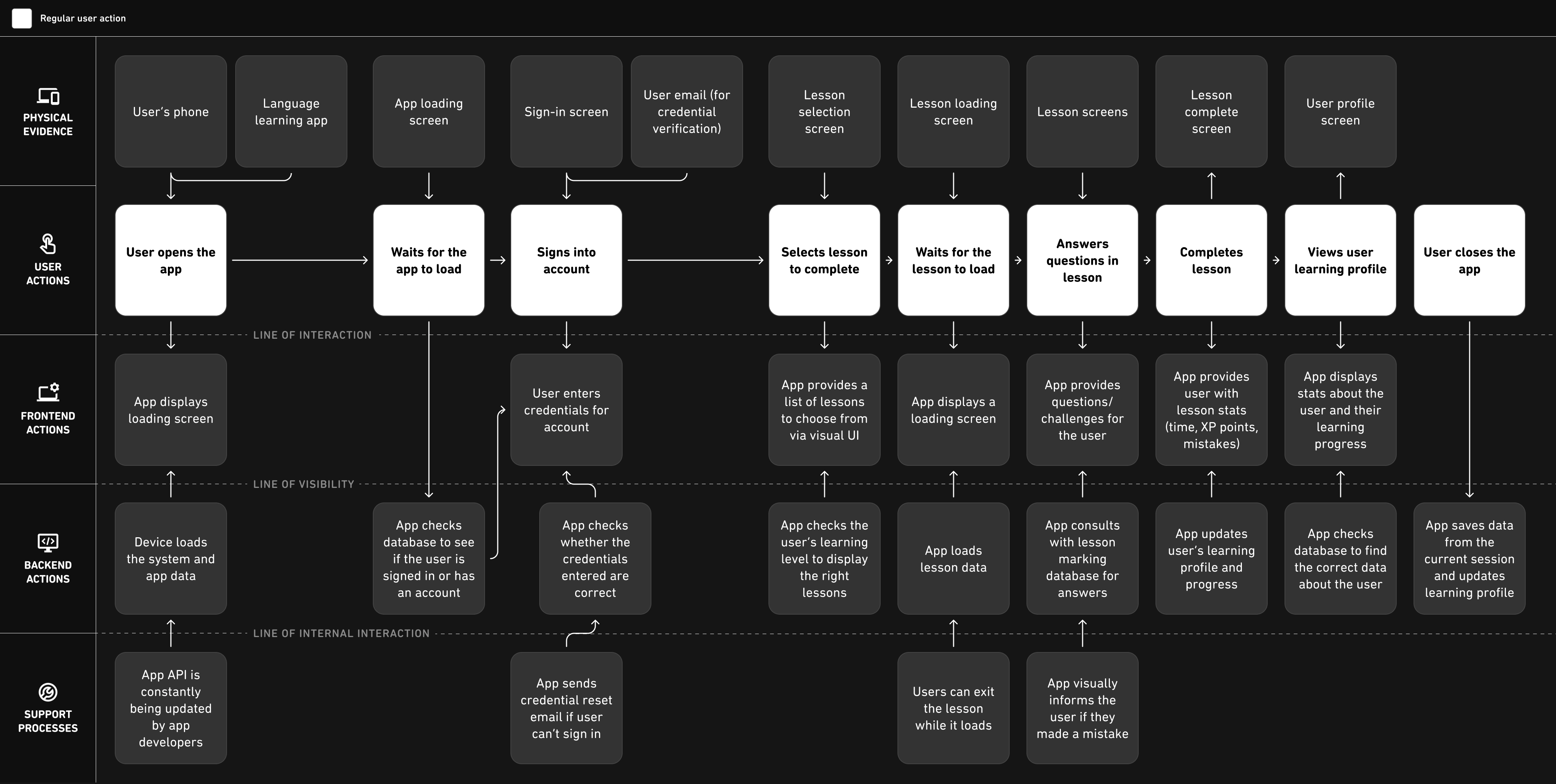
From here, I started examining the current structure of Duolingo through a service blueprint to understand how users currently interacted with a simple task such as opening the app and completing a lesson. This high-level breakdown was used to identify where changes could be make based on feedback from users.
Using a priority matrix, potential changes to Duolingo's current user experience were ranked based on importance and their impact on the app; of these changes, three were selected to move onto the next phase of development. Due to the timeline provided for the project, the selected choices were scaled down to two with the third as a back-up option.


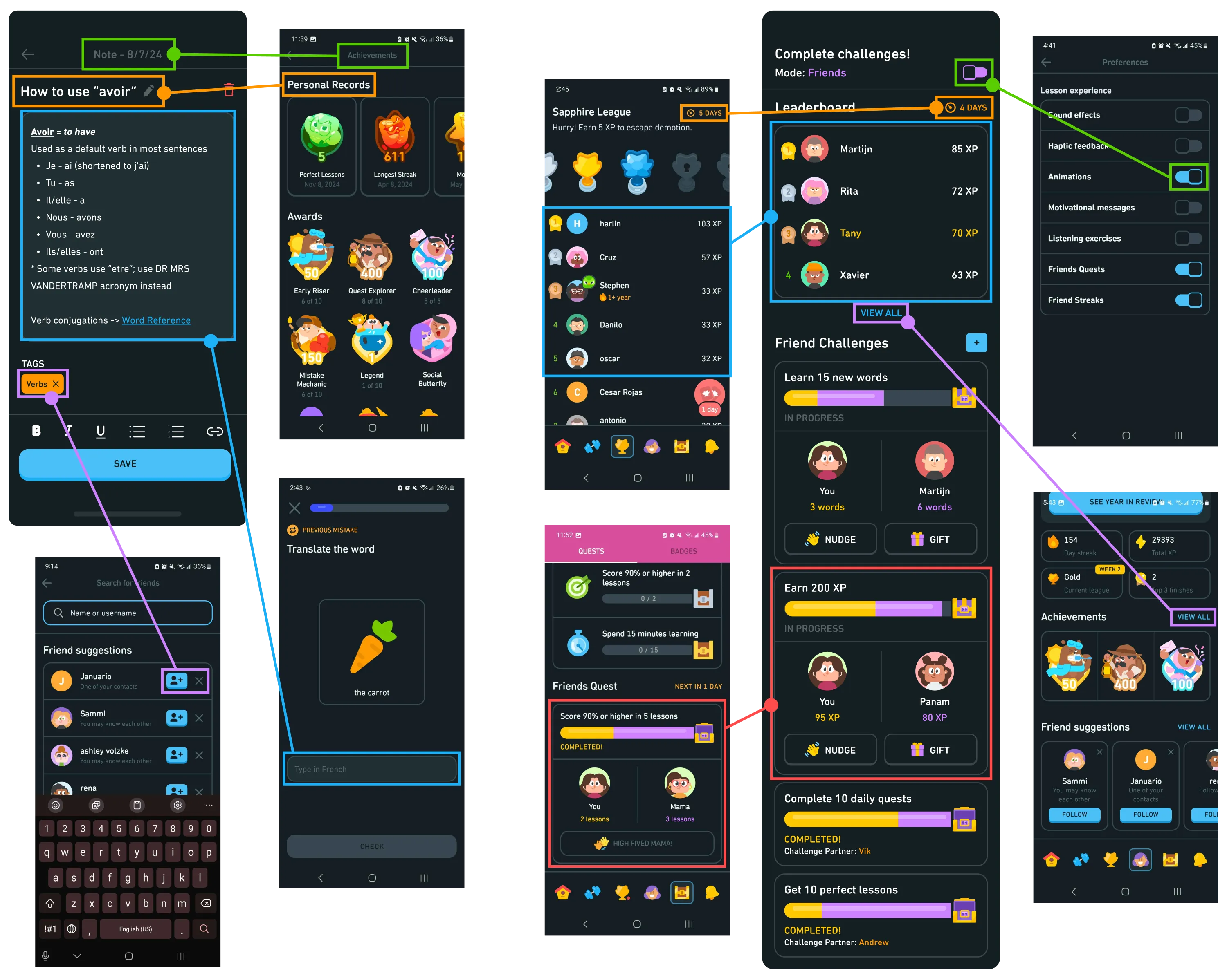
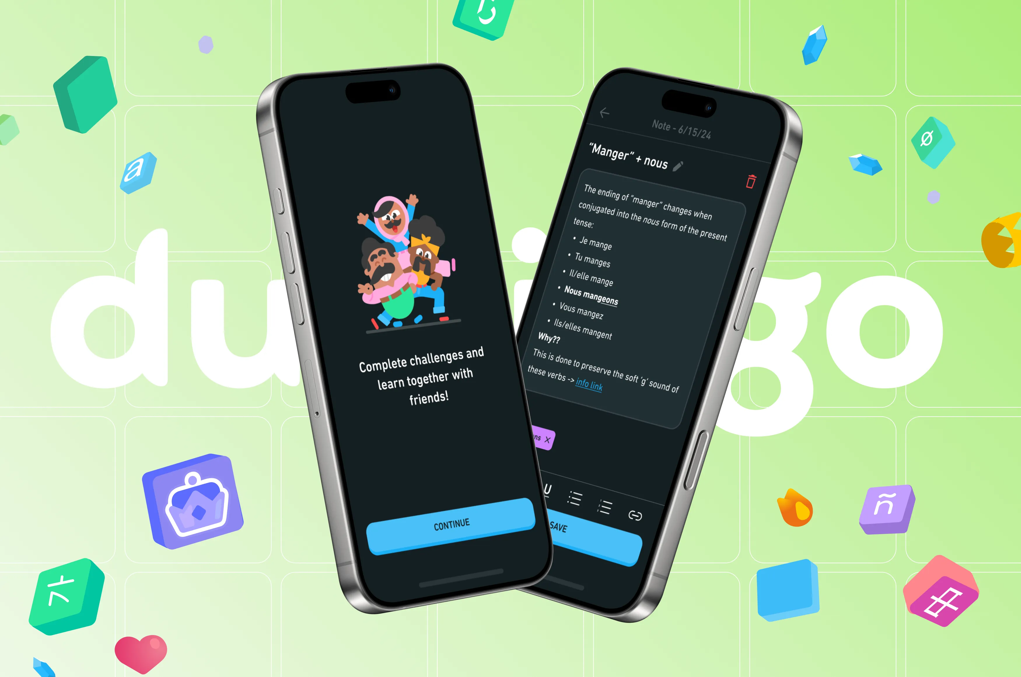
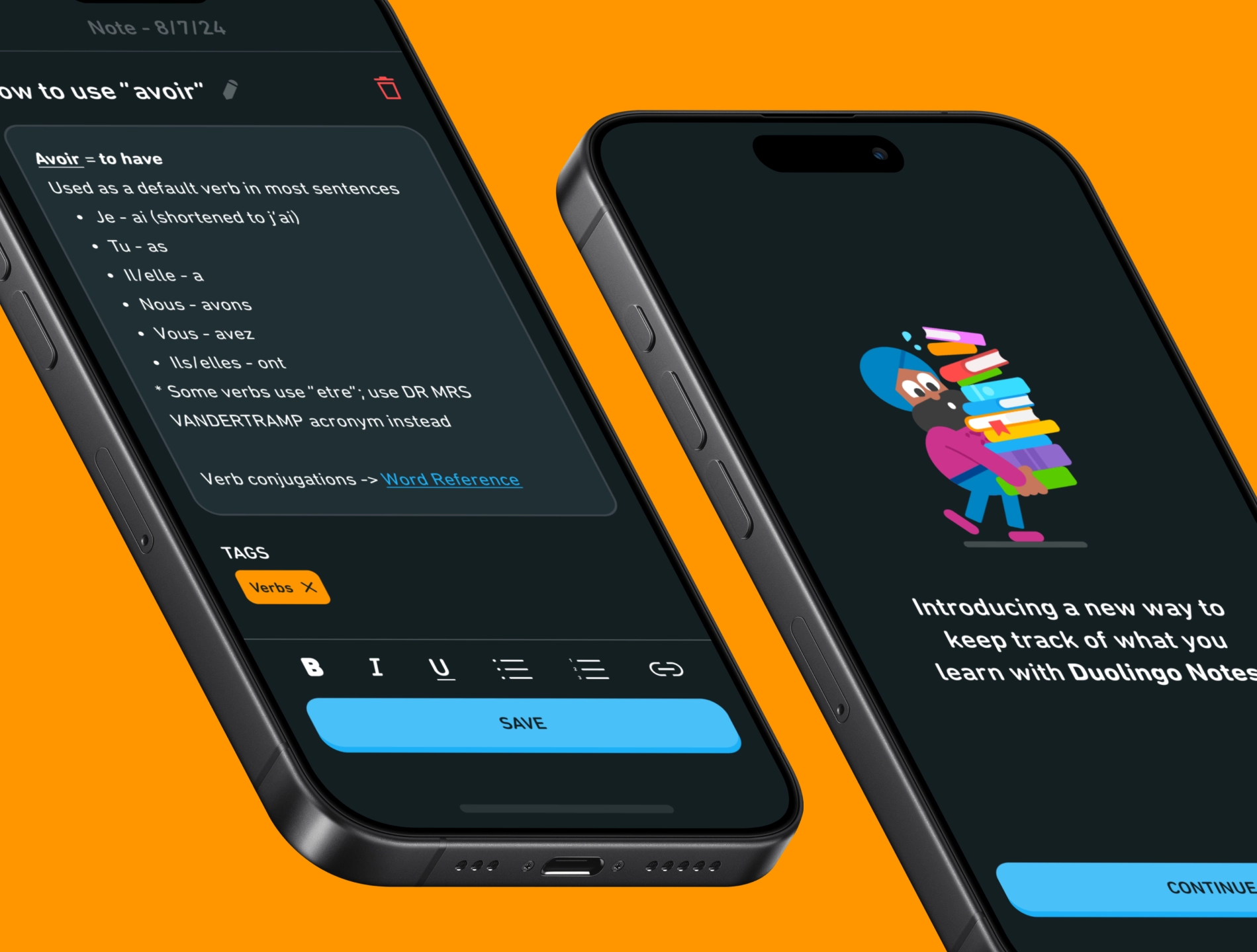
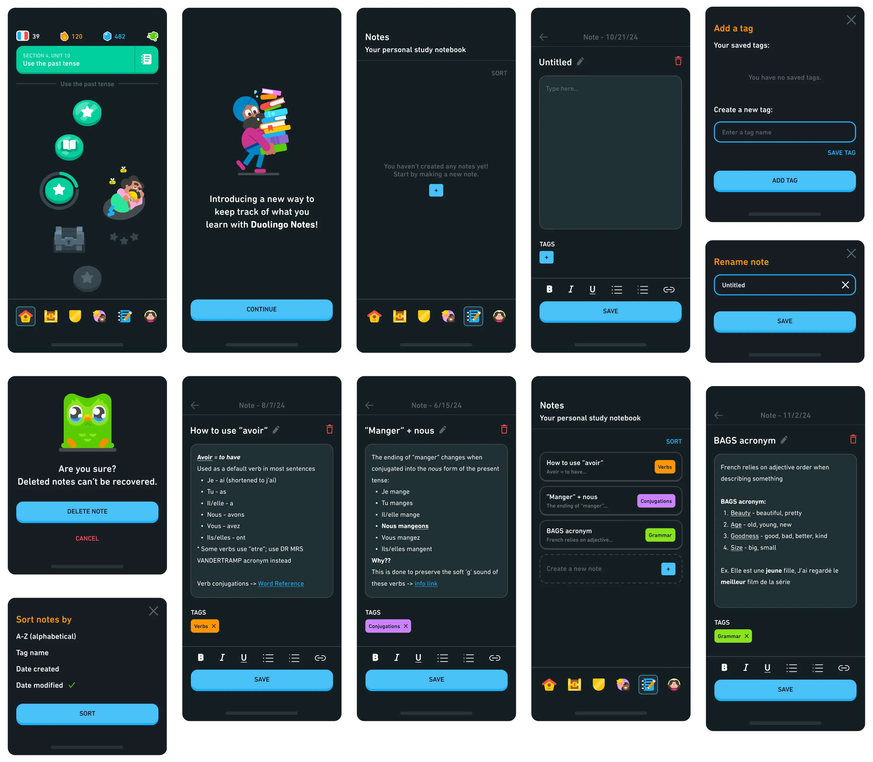
The first change introduced in this case study is DUOLINGO NOTES, note-taking feature that simulates being able to make your own notes within the Duolingo app. It uses the same visual style and interactions as a basic notepad or notes app, as found on many mobile devices. Tags can be added to categorize notes, completely user-controlled and definable according to their needs. Not only does a note-taking system better help users retain learning material and reduces the need to redo lessons, but also re-introduces habits that were present during their education.
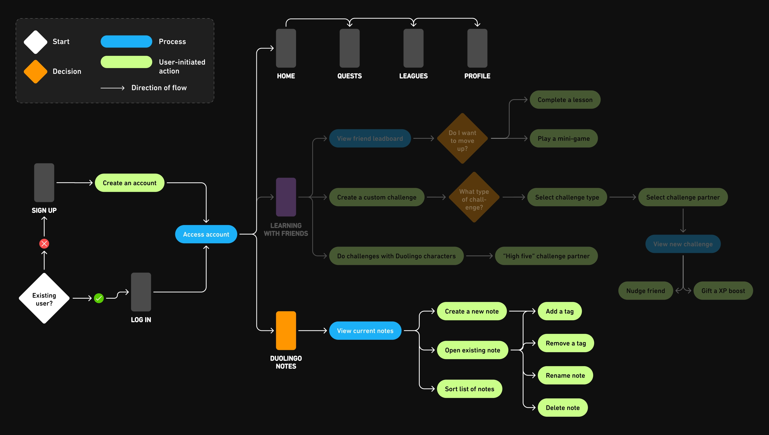
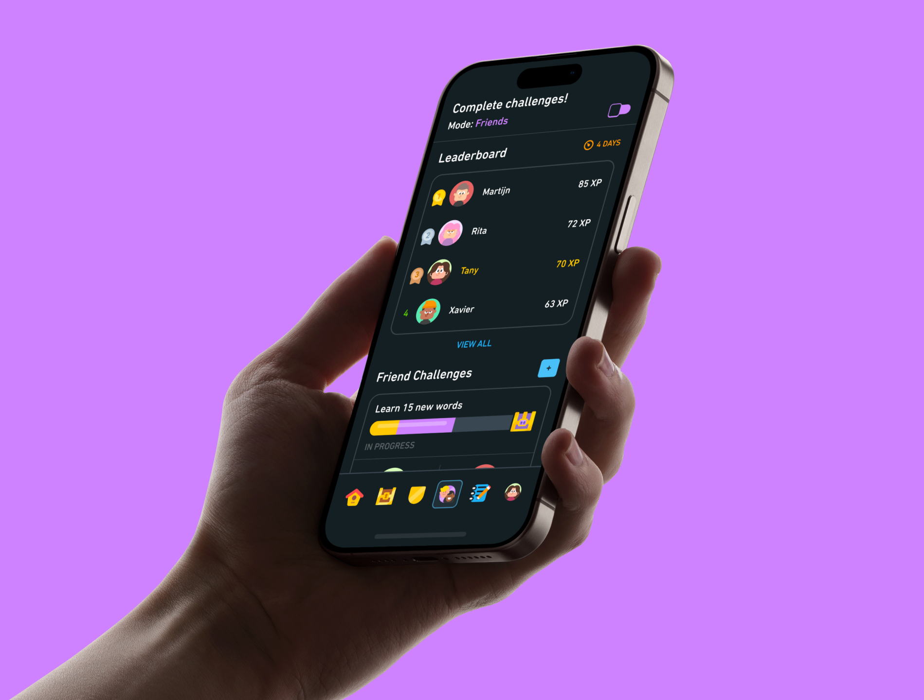
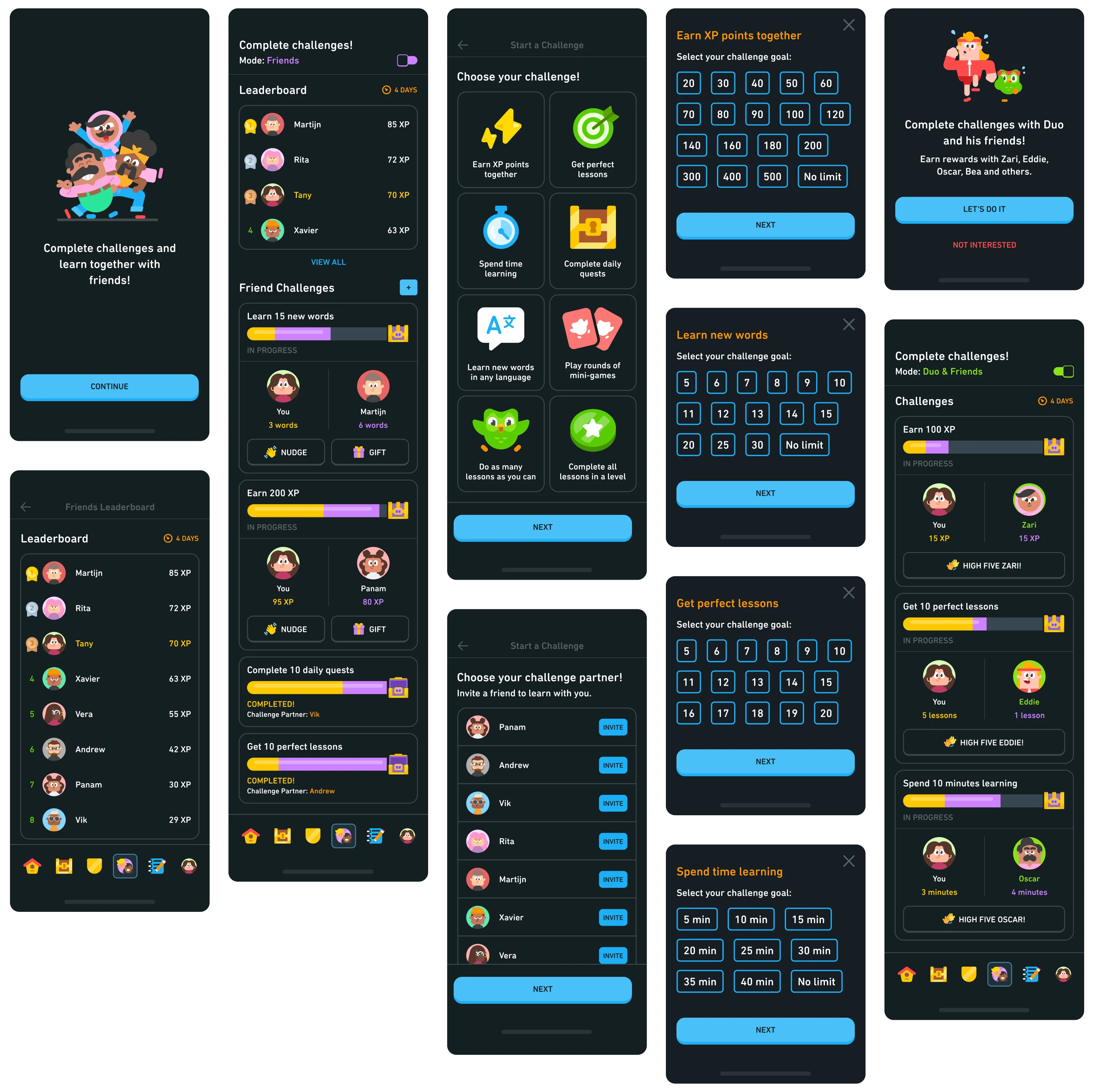
LEARNING WITH FRIENDS expands the current system for using Duolingo with added friends. Although Duolingo allows you to connect with other users, there are limited interactions aside from app-controlled challenges/quests and maintaining a streak; conversely, having no friends on the app means users miss out on collaborative learning experiences. With the expanded system, users can now select custom challenges and invite their friends to participate; healthy competition and rivalry is encouraged through a friends-only leaderboard.
The feature also caters to users who don't have added friends, enabling the app's cast of characters to step forward as challenge/quest partners. The progress made by the app’s characters would be dependent on their personalities. For example, Zari is depicted as a studious person who is eager to learn; she is more likely to contribute more to a quest than someone like Junior, who is depicted as a young child and easily distracted by other interests.

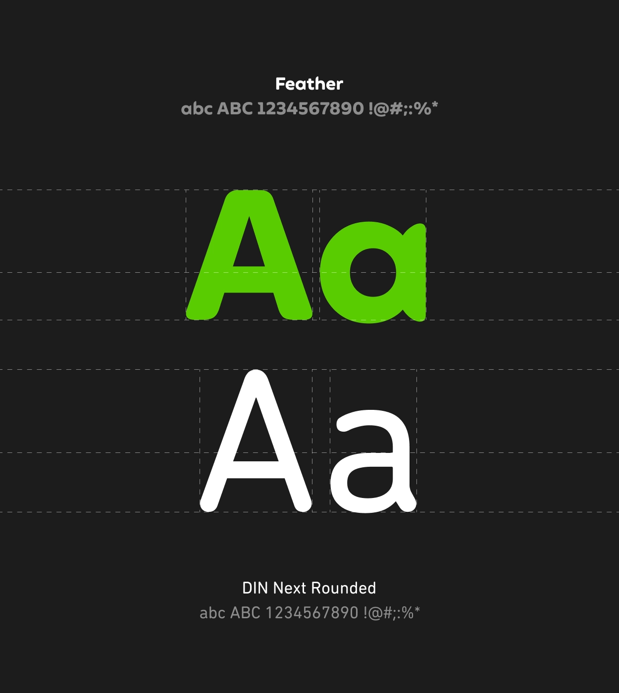
Duolingo is a highly visual brand, relying on bright colours, rounded typography and shapes, cartoon-like characters and a sense of approachability that makes learning fun. Given I was designing the new features as an extension of what already exists, it was important to replicate the Duolingo interface as closely as possible. Although Duolingo's brand kit provided visual guidelines for its material, many interactive elements were designed by hand; layout designs and placement of elements referenced screenshots of the app's Android version.