Client: Friends of the Vancouver Public Library (VPL)
Roles: Visual designer, web developer
Year: 2025
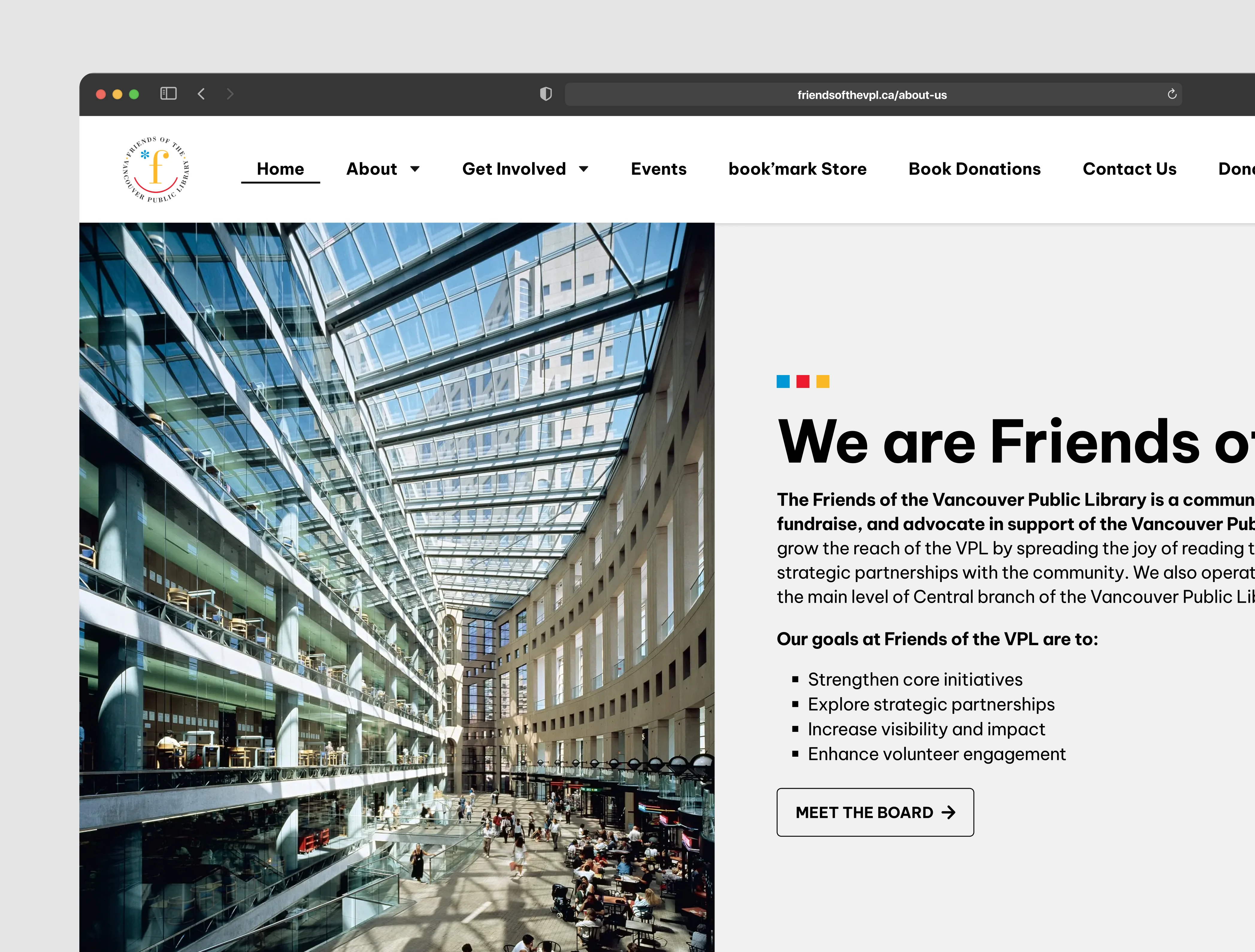
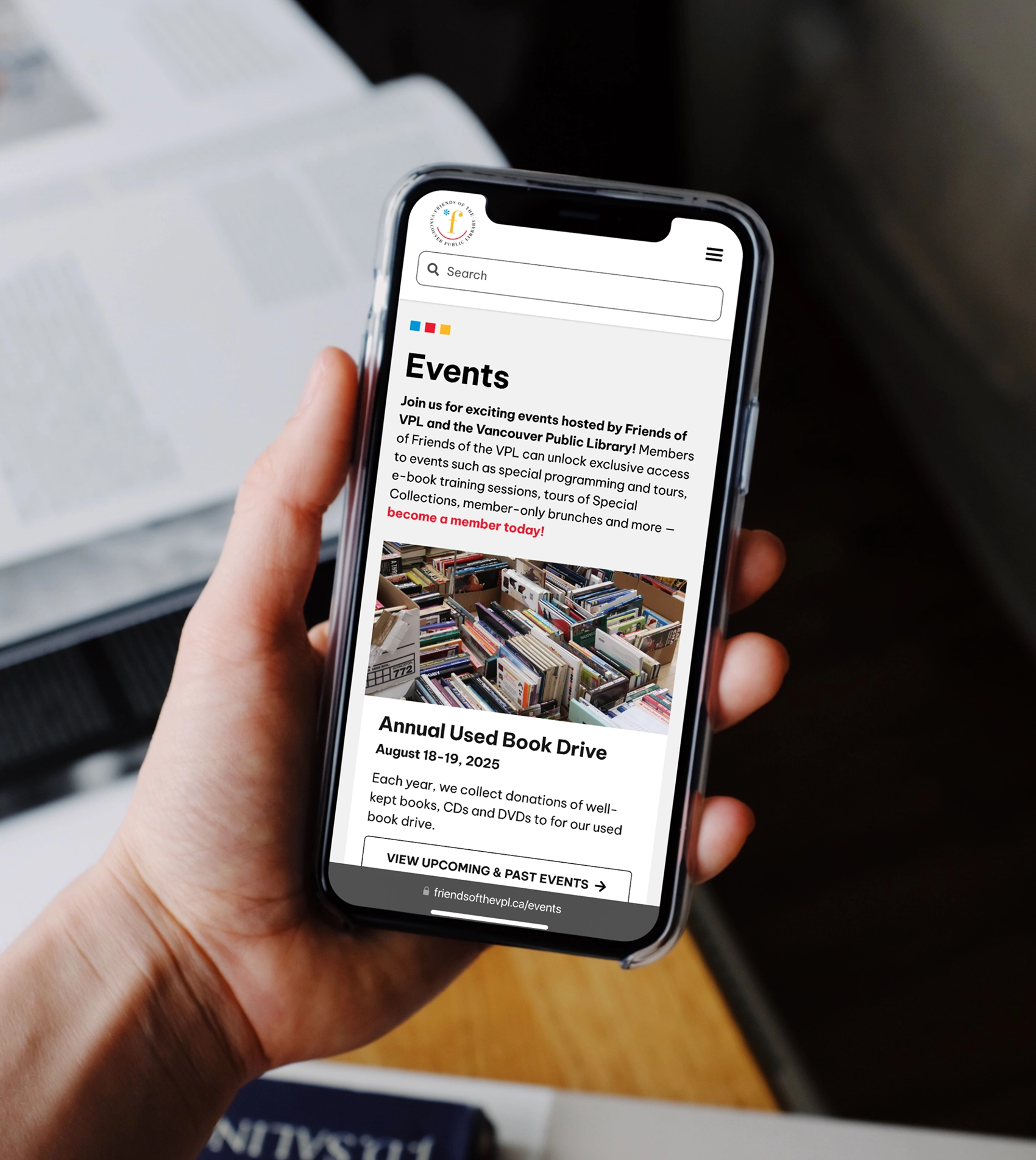

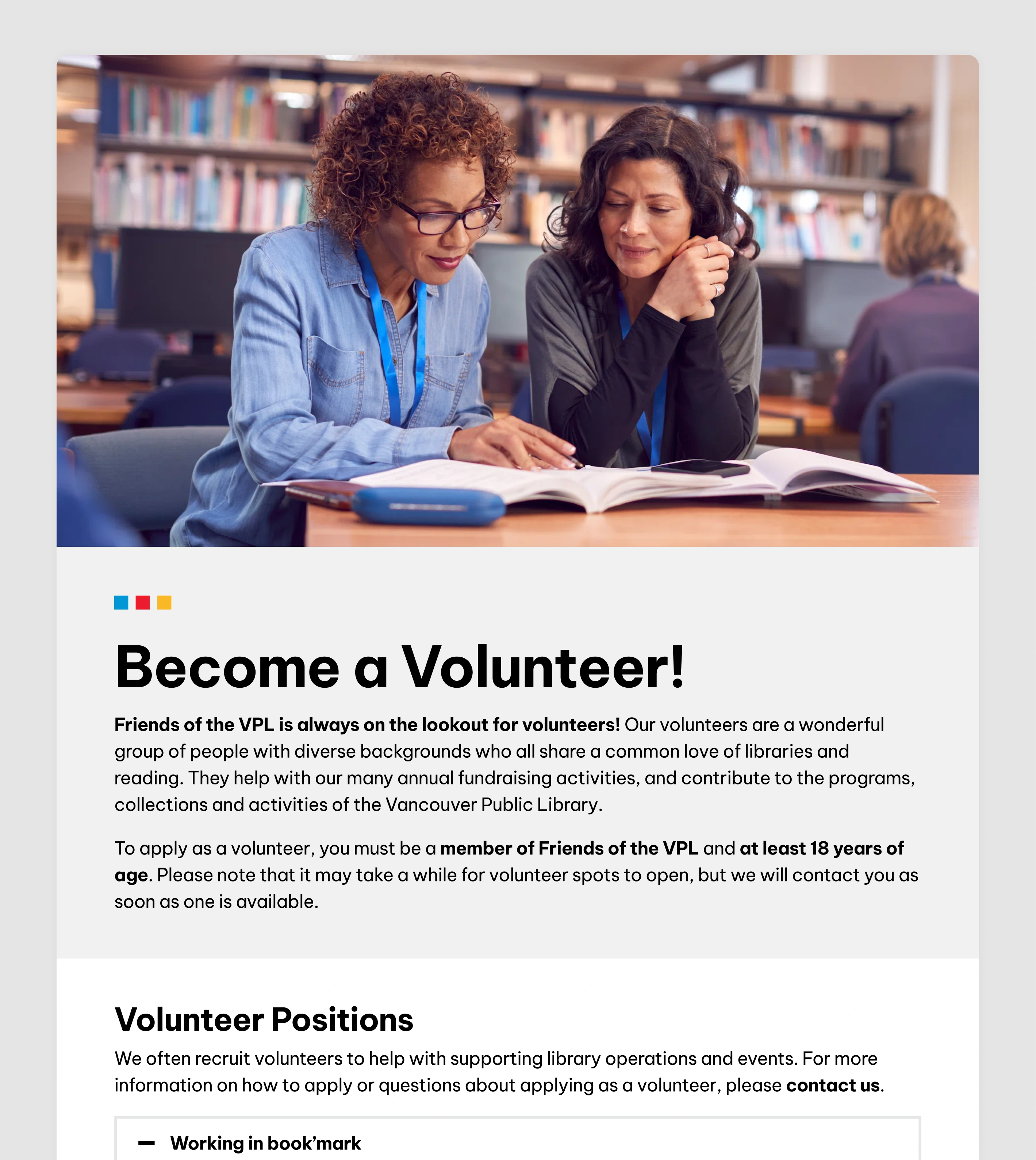
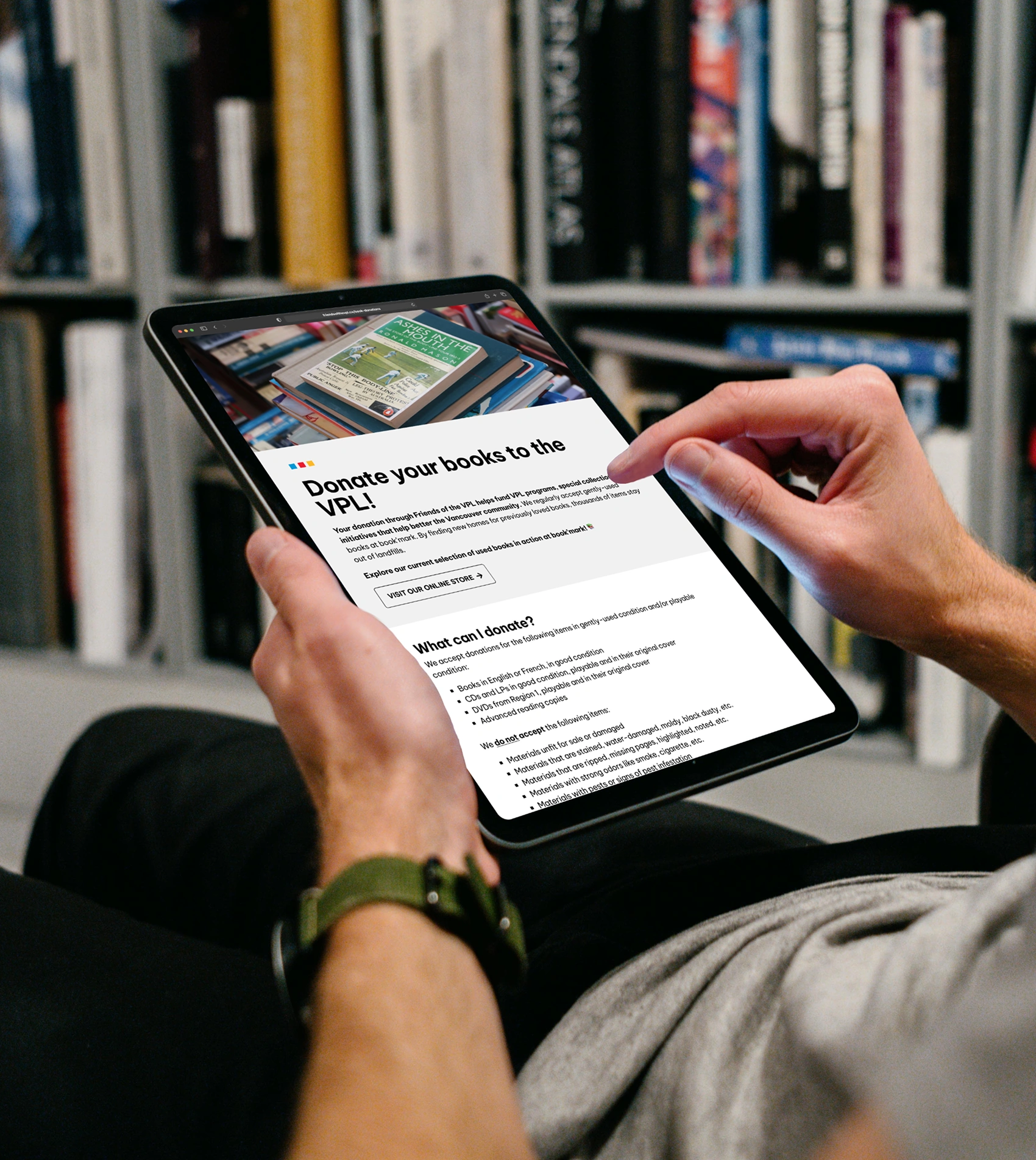
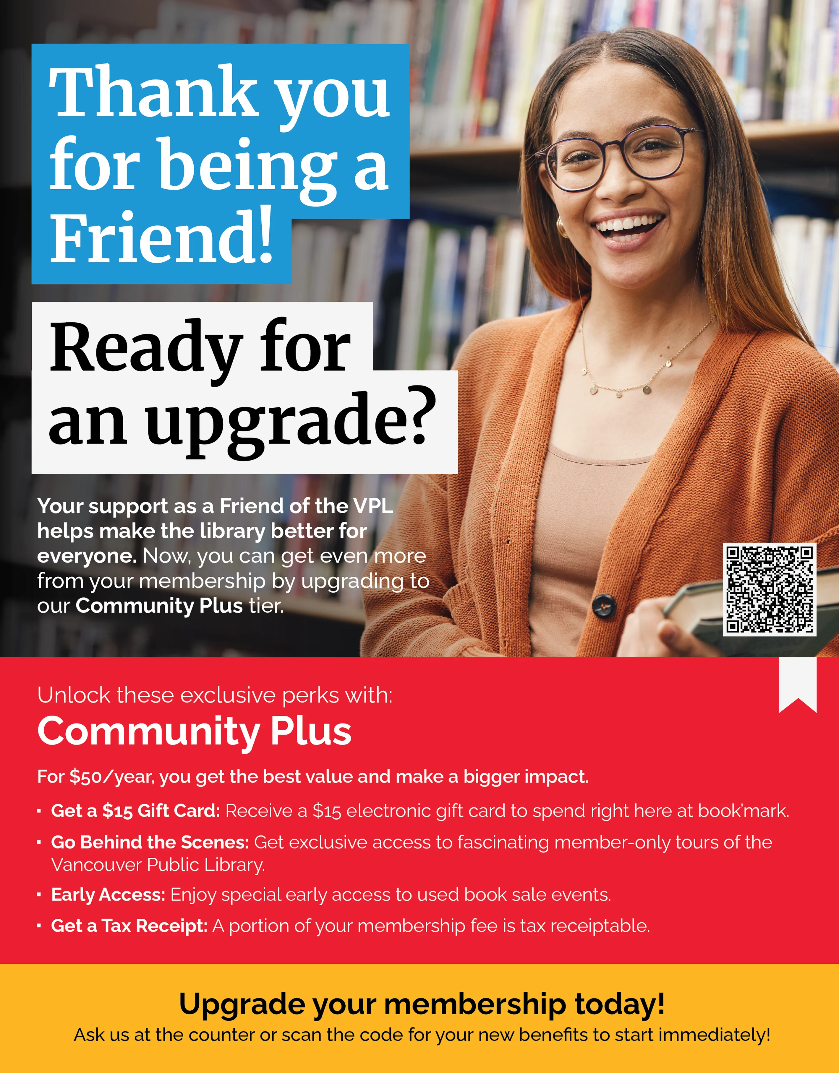

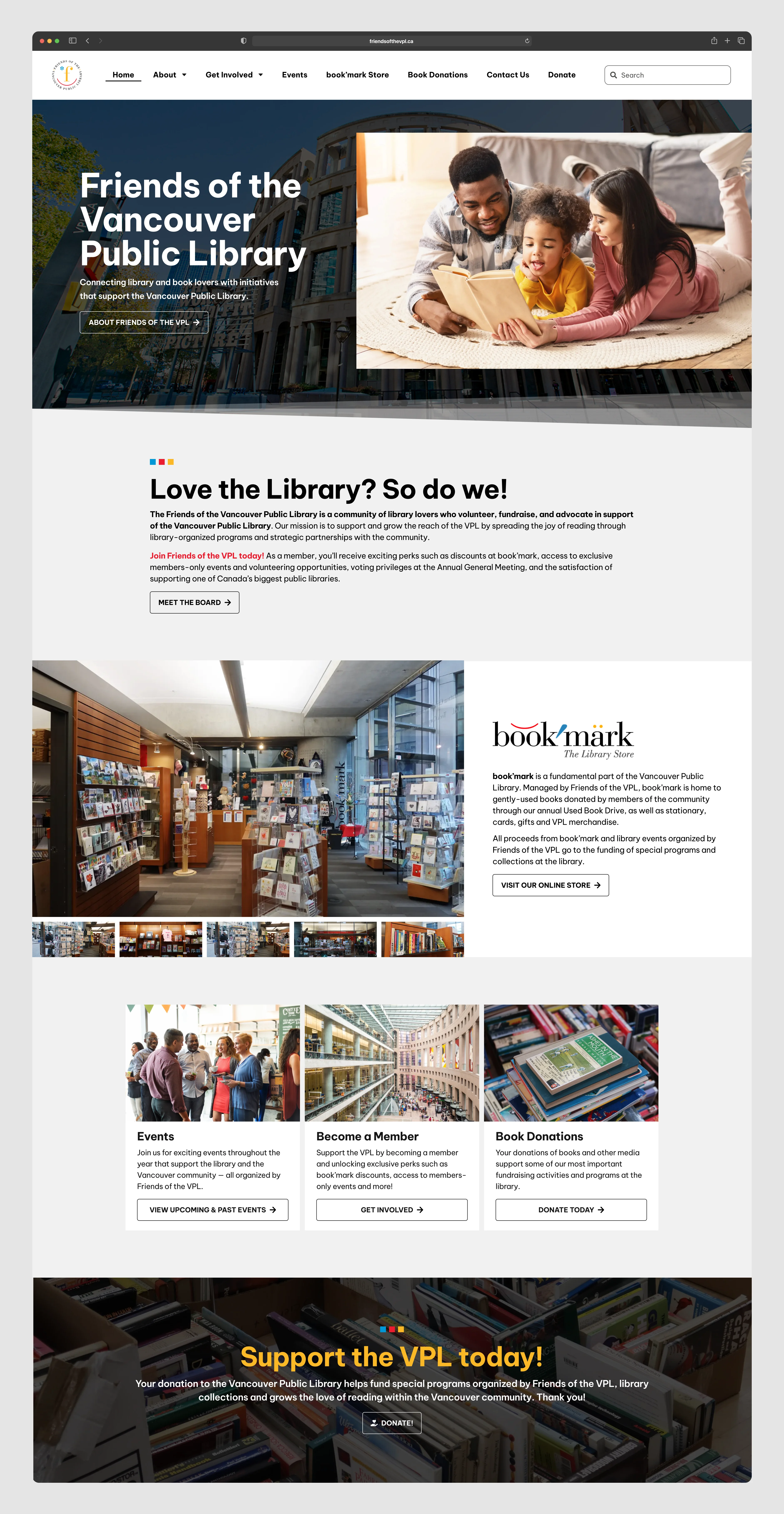
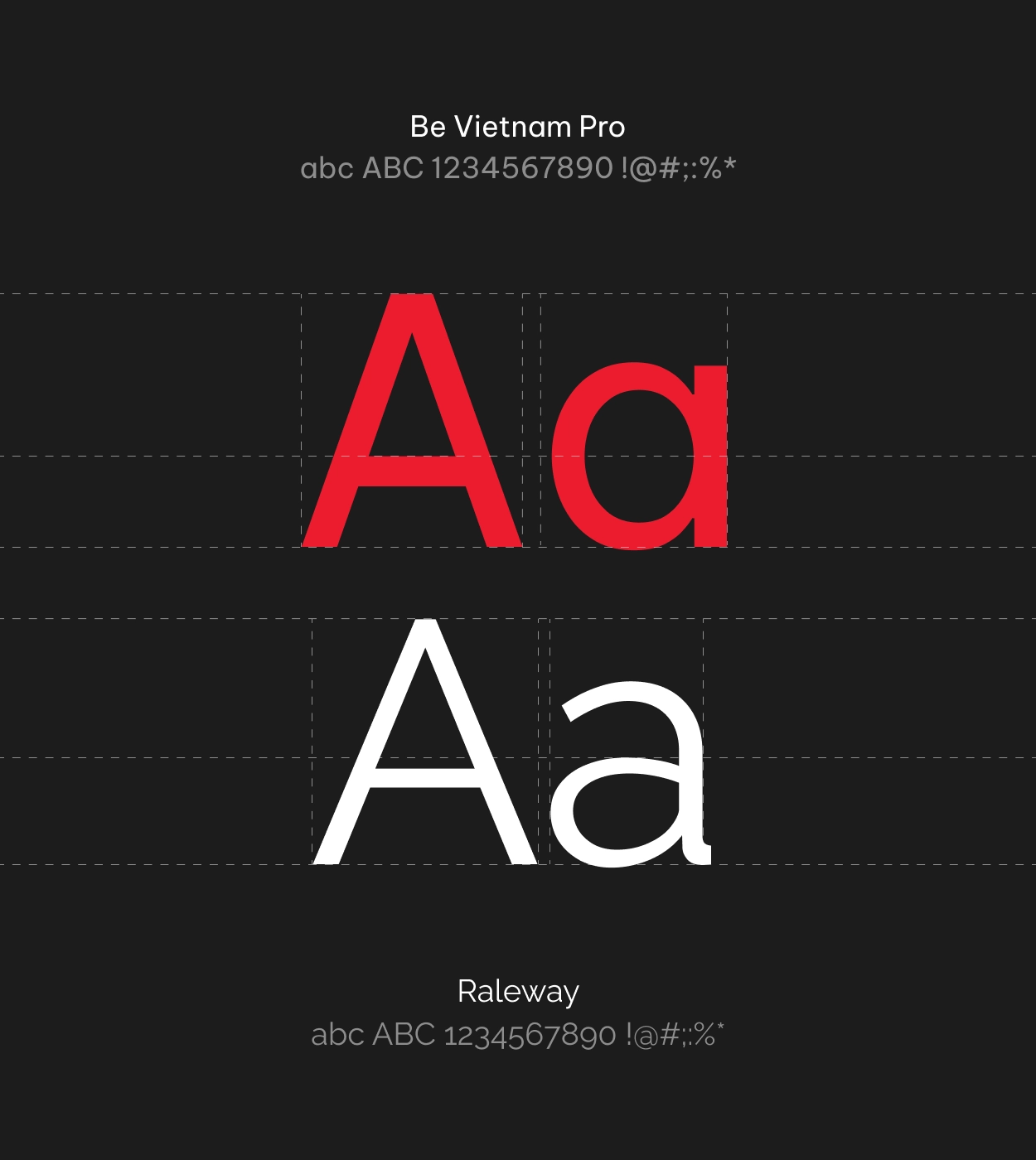
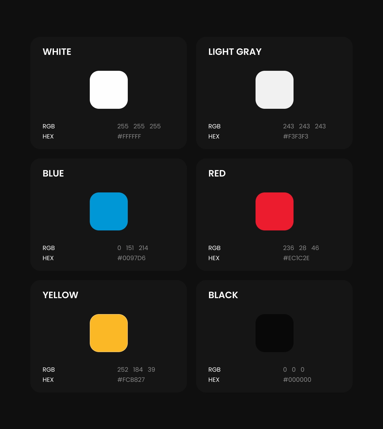
The styling of the Friends of the VPL website blends branding elements from the previous edition of the site with the Vancouver Public Library's branding. The trio of squares featuring the primary brand colours is utilized as a header accent on all pages, inspired by physical signage present at the Central Branch of the library. Featuring Be Vietnam Pro as the selected typeface for the website, the structure relies on simple layouts for text and images with the intention of keeping the visual load light for users. Raleway is used on the promotional posters, exploring designs that combine library-related imagery with the Friends of the VPL brand colours.